Data Science Tutorial for Absolutely Python Beginners


My anaconda don't, My anaconda don't, My anaconda don't want none, unless you've got....
Yes, you are still reading Code A Star blog.
In this post we are going to try our Data Science tutorial in Python. Since we are targeting Python beginners for this hands-on, I would like to introduce Anaconda to all of you.
All-in-one starting place
For our Data Science tutorial, there are not many lines to code actually. But we have to spend time understanding the basic concept, modules and functions used in our program. And we have to install several libraries for Python to do the science like:
- Matplotlib - a plotting library to make histograms, bar charts, scatter plots and other graphs
- NumPy - a fast library for handling n-dimensional array
- Pandas - a set of data structures tools
- Scikit Learn - a machine learning library that we use it to teach our computer and make prediction
You can install above libraries by using the friendly Python command -- pip. But do you remember what we have sung said on the first paragraph? Yes, the Anaconda. It is a Python environment bundled with all essential data science libraries. That means, you can simply use Anaconda to start a data science project instead of pip'ing those libraries one by one.
My Anaconda does
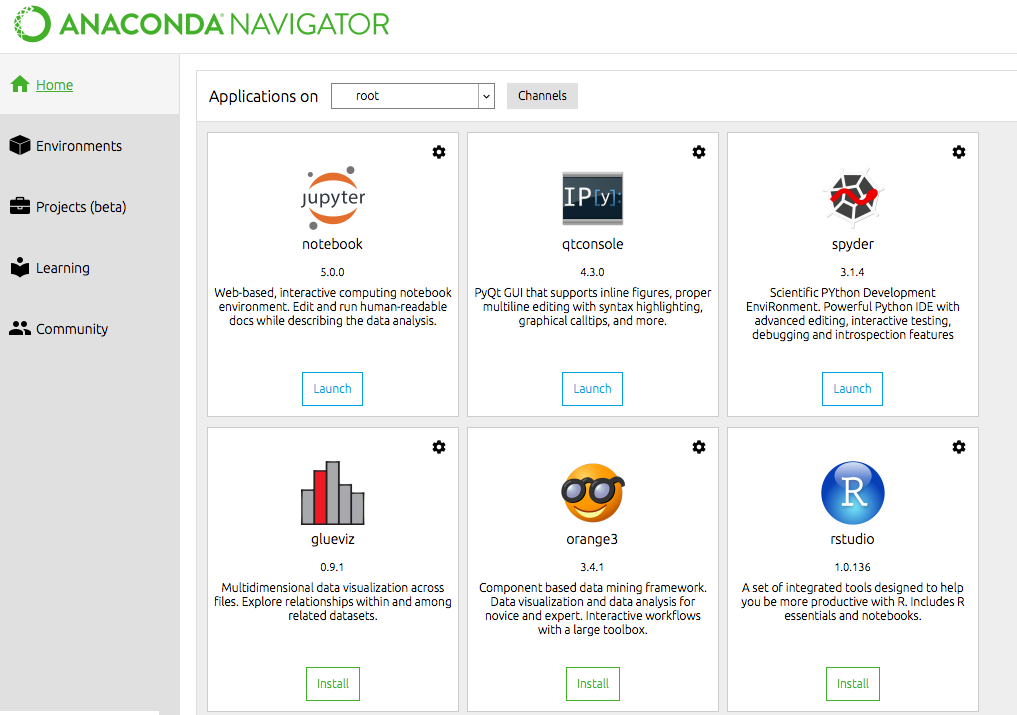
Once you open Anaconda, you would see a similar interface likes below:
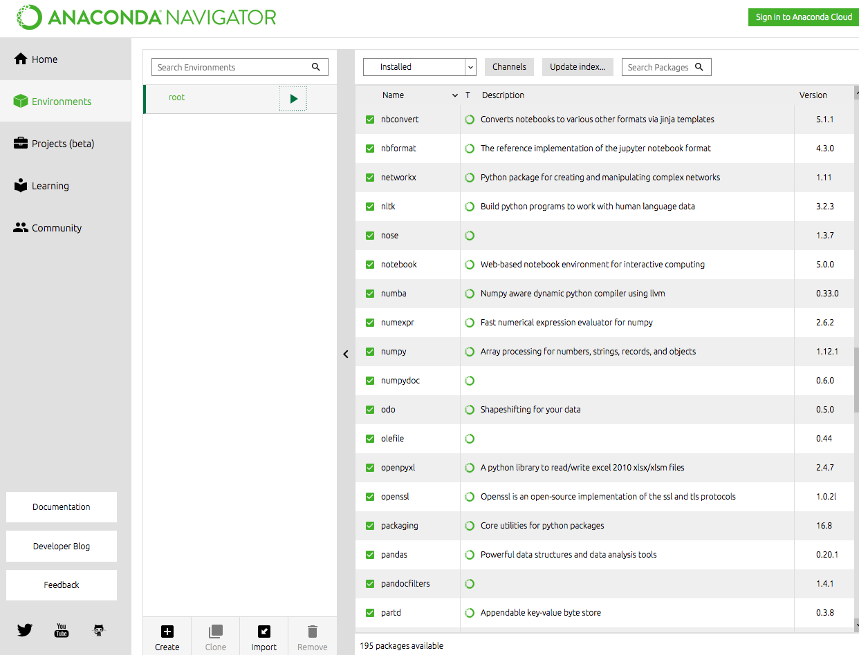
Click "Environment" on your left and there are tons of Python libraries installed in the environment, including those data science libraries we have mentioned:
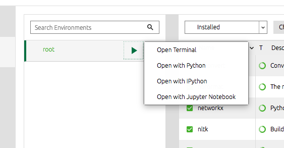
What we do next is, start our project by clicking the green arrow button and select "Open with Jupyter Notebook" option:
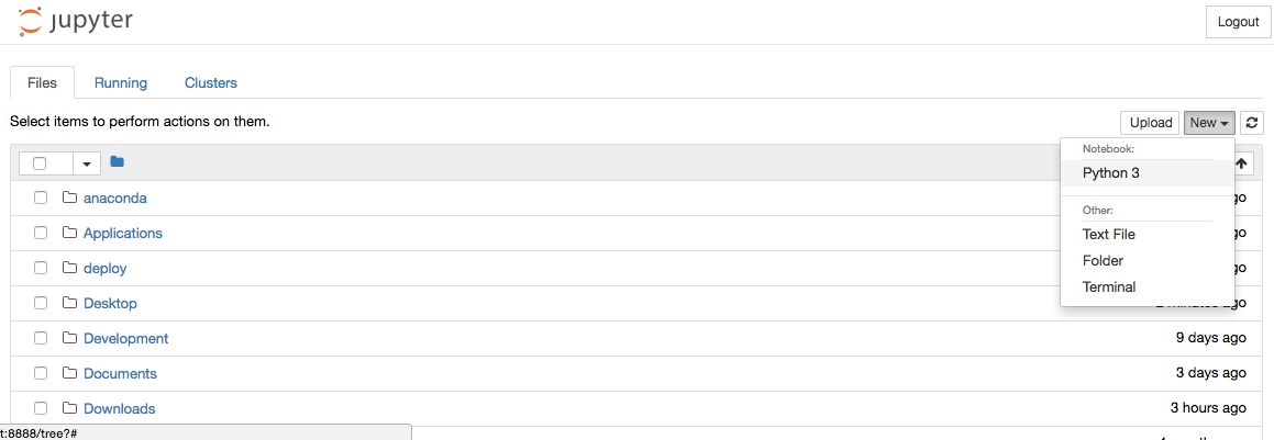
Jupyer Notebook is a web application for users to create and share (not only) Data Science projects in (not only again) Python. We can click the "New" button in the upper right corner and select "Python 3":
A Python development UI is then launched. Okay, here we go, our science starts here:
Do you remember the Data Science Life Cycle?
You can click here to recall your memory. We are going to do the "Hello World" of Data Science --- the Iris Classification and the first step of our project is: define a problem.
Iris Classification is a data set of 150 iris plants categorized into 3 classes. Our problem for this project is: when we have some iris plants, which class should our plants belonged to?
We move to step 2 of the Data Science Life Cycle, collect data. Since Iris Data Set is a famous data pattern recognition resource, we can simply download it from the web (yeah, that is why it is the "Hello World" of Data Science).
Now, let's put our coding parts on Jupyer Notebook. Firstly, we import our required Data Science modules(the modules which we have mentioned above):
import pandas as pd
import numpy as np
import matplotlib.pyplot as plt
from sklearn.svm import SVC
from sklearn.metrics import accuracy_score
from sklearn.metrics import classification_report
from sklearn.metrics import confusion_matrix
Secondly, we obtain our data set using Pandas's read_csv function as a variable(df, dataframe in short):
df = pd.read_csv("http://archive.ics.uci.edu/ml/machine-learning-databases/iris/bezdekIris.data",
names = ["Sepal Length", "Sepal Width", "Petal Length", "Petal Width", "Class"])
Other than read from web, you can use pd.read_csv() to read from your file system. i.e. pd.read_csb("/your_directory/your_filename"). Since there is no header inside the data file, we make one by using names = [.....] parameter. The header is following iris data set's attribute description on its source page.
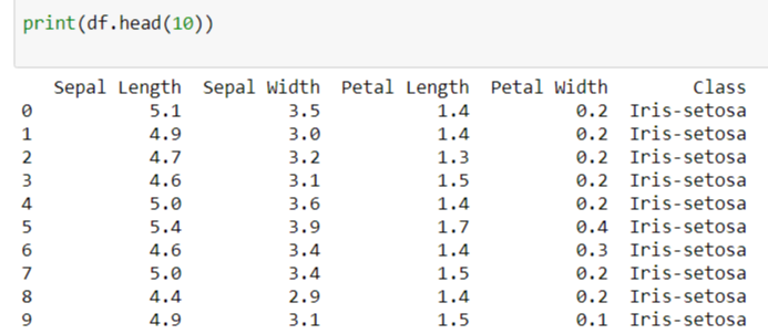
You can print out the first 10 records of our data set to make sure everything is right:
print(df.head(10))A data grid would be printed out like this:
Is it magic? No, it is our Data Science Tutorial
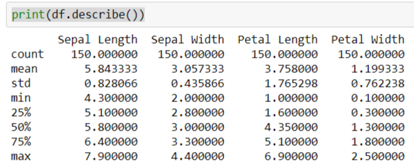
Pandas' dataframe can do more other than just showing us the content of data, try using its describe() function:
print(df.describe()) See? It can calculate the means and standard deviations of our data set:
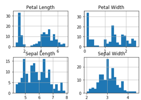
It can even plot a histogram for us, its hist() function transforms data into histogram data. I set the bin size set to 20 for accuracy and resource balance. Then use matpotlib (plt) module to show the graph:
df.hist(bins=20)
plt.show()
A histogram with data attributes inside our data set is then generated:
Machine Learning Time
We have a problem to solve and we have collected a data set. So it is time to let a computer learn the data relationships and build a model to solve the puzzle.
There are 150 records from the Iris data set, we would pick 80 out of 150 randomly for machine learning.
data_array = df.values
np.random.shuffle(data_array)
X_learning = data_array[:80][:,0:4]
Y_learning = data_array[:80][:,4]
We transform our dataframe, df, into a n-dimensional array, data_array. And shuffle its order with NumPy function .random.shuffle() . We take the first 80 records with 4 attributes (sepal length, sepal width, petal length and petal width) as X_learning. And take 80 related classes (the 5th attribute) as Y_learning.
Then we pick a model from Sciki Learn library as our machine learning model. There are several models available on Sciki Learn library. I choose Support Vector Machine, SVC(), as our model, as it is shorter to type for our tutorial ( :]] ) .
svc = SVC()
svc.fit(X_learning,Y_learning)
Using .fit() function, we let the machine learn, by teaching it about the data relationship: with attributes like X_learning, they would get Y_learning classes.
Review Predictions
We have an "educated" machine, it is time to see rather it is reliable enough to solve our problem. Now we take the last 20 records from our shuffled array as testing data. X is the array of data attributes to be tested, while Y is the set of the answers to be used in verification process later.
X = data_array[-20:][:,0:4]
Y = data_array[-20:][:,4]
To get our predictions, just simply put the X in our model svc using .predict() function:
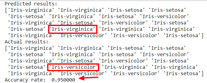
predictions = svc.predict(X)Then we go to compare predicted results, predictions, with the actual results, Y. And get the accuracy rate by using accuracy_score(<actual results>, <predicted result>).
print("Predicted results:")
print(predictions)
print("Actual results:")
print(Y)
print("Accuracy rate:  %f" % (accuracy_score(Y, predictions)))
95% accuracy rate, not bad.
We can get confusion matrix and classification report for analysis:
print(confusion_matrix(Y, predictions))
print(classification_report(Y, predictions))
And we get the matrix and report on Juypter Notebook like:
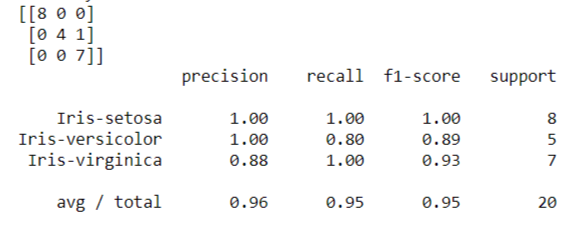
Feel confusing on the confusion matrix? Let read the matrix like this way:
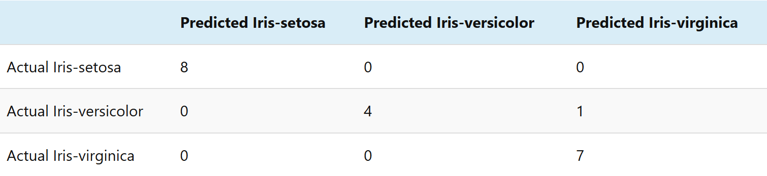
It is the matrix to see which class is predicted wrong. For our case, we have 5 iris versicolor results, which 4 are predicted as iris versicolor and 1 is wrongly predicted as iris virginica.
We might need to find out rather we need more data on iris versicolor class, or use other models for better predictions. It is a duty for Data Scientist to make better and better data outcome. But right now, we have our first Data Science program, and we can use it to classify iris classes!
Science is about keep researching to find out the knowledge, once we work more on Data Science, we sharpen our skill and get better and better ever since. Keep coding mates!
The complete source can be found at https://github.com/codeastar/python_data_science_tutorial .
What we have learnt on this hands-on:
- how to start a Data Science project in Anaconda
- data collection using Pandas
- machine learning using Sciki Learn
- predict outcome using collected data
- analyze the results