Revenue Prediction in Google Store


Every business owner wants to make revenue prediction, so he or she can have better marketing decisions. On Kaggle, the data science community site, there is a challenge on making a store's revenue prediction. And that is the topic we are looking for. The store in this challenge is none other than the Google Merchandise Store. (It seems Google did not spend enough on Google Plus's revenue prediction, at the end they just lost the direction and decided to close it. :]] )
When Big Data is really Big
We handled the TalkingData Click Fraud challenge with big training dataset in the past. That was a dataset with 200 million records in 1.2GB file size. This time, we handle a dataset with 1.7 million records, but well, in 23.7GB file size. Once again, it is impossible to load the file directly from the Kaggle's 17GB kernel. It should be impossible to load the file from a machine with 32GB ram also. But, by using the trick we learnt from TalkingData challenge --- nrows, we can load a part (20 rows) of the dataset file first. df = pd.read_csv('../input/train_v2.csv', nrows=20) df.head() Then we find the reason why the dataset file is so big:
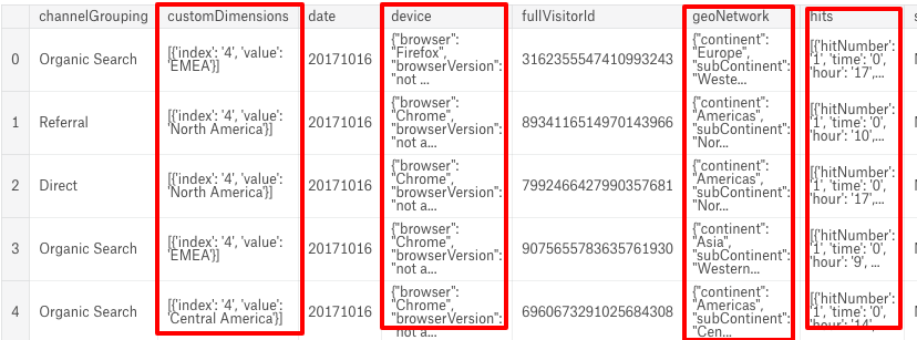
There are several JSON columns stored inside the file, which contain multiple objects on each row that increase the file size.
So now we have to face 2 issues on the training dataset file:
- Loading a huge file
- Handling records with JSON objects
For the first issue, we can load the 1.7 million plus records in 18 rounds. Then we handle 100 thousand records a time. For the second issue, it is good that Python has a json_normalize API for us. We can simple use it to normalize JSON objects into flat table structure. i.e. it transforms nested JSON objects into different columns in a dataframe.
Does everything look good?
Not really. By using json_normalize, we can retrieve normalized columns from the dataset. However it turns out we have so many columns there.
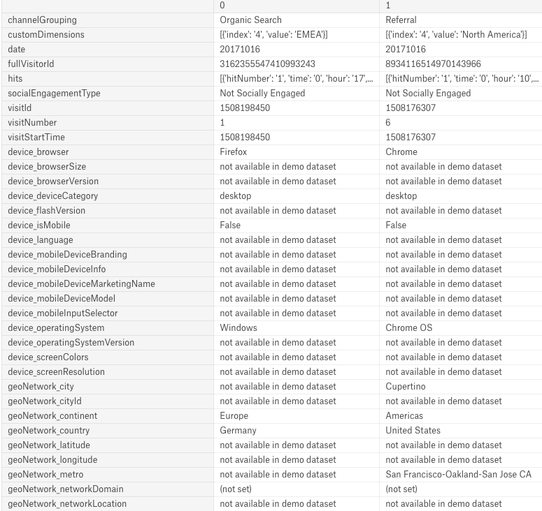
We finds that there are several columns containing the same content.
cols_w_same_content= [c for c in df.columns if df[c].nunique() <= 1] print('Columns with same content: ', cols_w_same_content)
And some of them are duplicated, like "customDimensions" and "geoNetwork_continent". So we have to filter those problematic columns and combine with the json_normalize method:
import json,time, gc from pandas.io.json import json_normalize def load_df(csv_path, chunksize=100000): #use only reasonable columns features = ['channelGrouping', 'date', 'fullVisitorId', 'visitId', 'visitNumber', 'visitStartTime', 'device_browser', 'device_deviceCategory', 'device_isMobile', 'device_operatingSystem', 'geoNetwork_city', 'geoNetwork_continent', 'geoNetwork_country', 'geoNetwork_metro', 'geoNetwork_networkDomain', 'geoNetwork_region', 'geoNetwork_subContinent', 'totals_bounces', 'totals_hits', 'totals_newVisits', 'totals_pageviews', 'totals_transactionRevenue', 'trafficSource_adContent', 'trafficSource_campaign', 'trafficSource_isTrueDirect', 'trafficSource_keyword', 'trafficSource_medium', 'trafficSource_referralPath', 'trafficSource_source'] #columns with JSON objects to normalize JSON_COLS = ['device', 'geoNetwork', 'totals', 'trafficSource'] print('Load {}'.format(csv_path)) df_reader = pd.read_csv(csv_path, converters={ column: json.loads for column in JSON_COLS }, dtype={ 'date': str, 'fullVisitorId': str, 'sessionId': str, 'totals_transactionRevenue' : 'uint64', 'visitId': 'uint64', 'visitNumber': 'uint8', 'visitStartTime': 'uint64', 'totals_hits': 'uint8'}, chunksize=chunksize) res = pd.DataFrame() for cidx, df in enumerate(df_reader): df.reset_index(drop=True, inplace=True) for col in JSON_COLS: col_as_df = json_normalize(df[col]) col_as_df.columns = ['{}_{}'.format(col, subcol) for subcol in col_as_df.columns] df = df.drop(col, axis=1).merge(col_as_df, right_index=True, left_index=True) res = pd.concat([res, df[features]], axis=0).reset_index(drop=True) del df gc.collect() print('Round {}: DF shape {}'.format(cidx + 1, res.shape)) return res start_time = time.time() train_df = load_df('../input/train_v2.csv') print ("Time used: {} sec".format(time.time()-start_time))
Then we can load all the 1.7 million records within the 17GB Kaggle's kernel in 10 minutes.
Revenue Prediction in Future
In this challenge, we are predicting customers' sum of transaction for December 1st 2018 to January 31st 2019, a future date range. First, let' see what we have in our training and testing datasets. We can use the interactive charts that we learnt from Avito Demand Prediction Challenge for data analysis. import plotly.graph_objs as go import plotly.offline as py py.init_notebook_mode(connected=True)
df2 = train_df.groupby('date')['totals_transactionRevenue'].sum().reset_index()
df3 = test_df.groupby('date')['totals_transactionRevenue'].sum().reset_index()
trace = go.Scatter(
x = pd.to_datetime(df2.date),
y = df2.totals_transactionRevenue,
name="Train df"
)
trace2 = go.Scatter(
x = pd.to_datetime(df3.date),
y = df3.totals_transactionRevenue,
name="Test df"
)
layout = go.Layout(
title = "Volume of Transaction Revenue among Train and Test datasets",
xaxis=dict(
title='Date',
rangeslider=dict(visible=True),
type='date'
),
yaxis=dict(
title="Volume of Transaction Revenue",
type='log',
autorange=True
)
)
data = [trace, trace2]
fig = go.Figure(data=data, layout=layout)
py.iplot(fig)
del df2, df3;gc.collect()
It turns out that we are using training data from August 1st 2016 to April 30th 2017, to predict the future revenue trend for customers from May 1st 2018 to October 15th 2018.
From the chart, it seems Google Store has done well in revenue making. But when we look closer the training data:
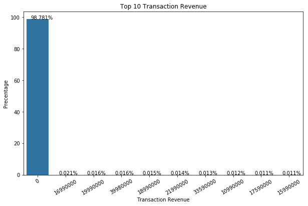
trx_gpby_fvid = train_df.groupby("fullVisitorId")["totals_transactionRevenue"].sum().reset_index() purchase_rate = trx_gpby_fvid['totals_transactionRevenue'].value_counts(normalize=True)*100 volume = purchase_rate[:10].index percentage= purchase_rate[:10].values plt.figure(figsize=(10,6)) ax = sns.barplot(x=volume, y=percentage, order=volume ) ax.set_xticklabels(ax.get_xticklabels(),rotation=30) ax.set(xlabel="Transaction Revenue", ylabel='Precentage') plt.title("Top 10 Transaction Revenue") for p in ax.patches: ax.annotate('{:.3f}%'.format(p.get_height()), (p.get_x()+p.get_width()/5, p.get_height()+.001)) plt.show()
We finds out ~98.78% customers just didn't spend:
Data Analysis by Charts
It is hard to predict the revenue from the 1.22% spending customers. But things would be easier when we use charts to understand our data. def generateBarScatChart(df, group_by, mean_by, x_axis, y_axis1, y_axis2, group_color="royalblue", mean_color="orangered", width=700, height=400, record_size=100): df2 = (train_df.groupby([group_by]).size().reset_index()).sort_values(0, ascending=False) df3 = train_df.groupby([group_by])[mean_by].mean().reset_index() df4 = df2.merge(df3, on=group_by, how='left')[:record_size] trace = go.Bar( x = df4[group_by], y = df4[0], name=y_axis1, marker=dict(color = group_color) ) trace2 = go.Scatter( x = df4[group_by], y = df4[mean_by], yaxis='y2', name=y_axis2, marker=dict(color = mean_color) ) layout = go.Layout( title = "Top {} {} and {} by {}".format(record_size, y_axis1, y_axis2, x_axis), xaxis=dict( title=x_axis, tickangle=45, ), yaxis=dict( title=y_axis1 ), yaxis2=dict( title=y_axis2, titlefont=dict( color=mean_color ), tickfont=dict( color=mean_color ), overlaying='y', side='right', type='log', autorange=True ), width = width, height = height ) data = [trace, trace2] fig = go.Figure(data=data, layout=layout) py.iplot(fig) del df2,df3,df4;gc.collect() We can start from OS first, see rather the choice of OS affect the number of visitor and the transaction revenue mean. generateBarScatChart(train_df, "device_operatingSystem", "totals_transactionRevenue", "OS", "Number of Vistor", "Volume of Revenue Mean", height=550)
MacOS and iOS users are more willing to spend comparing to Windows and Android users. And Chrome OS users spend more than all other OS users in general (we can guess most Chrome OS users are Google enthusiasts :]] ).
Then we go to see the difference among countries (geoNetwork_country).
The result is reasonable, just the Top 8th country, Vietnam, is disappointed with 0 transaction revenue at all.
What about day of week?
train_df["visitStartTime_date"] = pd.to_datetime(train_df['visitStartTime'], unit='s') train_df['visitStartTime_dayofweek'] = train_df["visitStartTime_date"].dt.day_name() generateBarScatChart(train_df, "visitStartTime_dayofweek", "totals_transactionRevenue", "Visit Day of Week", "Number of Vistor", "Volume of Revenue Mean", height=600, record_size=7, group_color="mediumseagreen", width=700)
People trend to buy less on Saturday and Sunday as there are notable drops on revenue. We should include day of week as our feature in the training model.
Build our model
There is still a lot of room for improvement on feature engineering. But, it is always good to build our base model first.
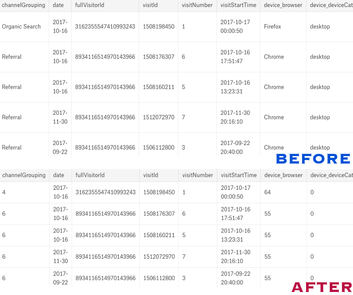
From our training and testing dataset files, we have normalized JSON columns. Our next move is, changing categorical data to numeric values. Like the Avito challenge last time, we can use the preprocessing.LabelEncoder() method again to convert those values.
from sklearn import preprocessing #get categorical columns, other than "fullVisitorId" cat_cols = [c for c in train_df.columns if (train_df[c].dtypes == object and c != "fullVisitorId" ) ] for col in obj_cols: print("Handling column: {}".format(col)) lbl = preprocessing.LabelEncoder() lbl.fit(list(set(train_df[col].values.astype('str')).union(set(test_df[col].values.astype('str')))) ) train_df[col] = lbl.transform(list(train_df[col].values.astype('str'))) test_df[col] = lbl.transform(list(test_df[col].values.astype('str')))
Now we are ready to prepare training (80% of our data) and validation (20% of it) datasets.
from sklearn.model_selection import train_test_split training_y = np.log1p(train_df['totals_transactionRevenue'].fillna(0).astype(float)) X_train, X_valid, Y_train, Y_valid = train_test_split( train_df, training_y, test_size=0.2, random_state=256) valid_fvid = X_valid["fullVisitorId"].values valid_ttxr = X_valid["totals_transactionRevenue"].values cols_to_drop = ['date', 'fullVisitorId', 'visitId', 'visitStartTime', 'totals_transactionRevenue'] X_train.drop(cols_to_drop, axis=1, inplace=True) X_valid.drop(cols_to_drop, axis=1, inplace=True) test_id = test_df["fullVisitorId"].values test_df.drop(cols_to_drop, axis=1, inplace=True)
And we use LGB (Light Gradient Boosting) model with basic settings as our training model. From our past post about LGB, the LGB model is good for handling large dataset. Moreover, LGB is fast in execution, it makes tuning easier in later stage.
import lightgbm as lgb def run_lgb(train_X, train_y, val_X, val_y, test_X): params = { "objective" : "regression", "metric" : "rmse", "num_leaves" : 30, "min_child_samples" : 100, "learning_rate" : 0.1, "bagging_fraction" : 0.7, "feature_fraction" : 0.5, "bagging_seed" : 2018, "verbosity" : -1 } lgtrain = lgb.Dataset(train_X, label=train_y) lgval = lgb.Dataset(val_X, label=val_y) model = lgb.train(params, lgtrain, 1000, valid_sets=[lgval], early_stopping_rounds=100, verbose_eval=100) pred_test_y = model.predict(test_X, num_iteration=model.best_iteration) pred_val_y = model.predict(val_X, num_iteration=model.best_iteration) return pred_test_y, model, pred_val_y pred_test, model, pred_val = run_lgb(X_train, Y_train, X_valid, Y_valid, test_df)
You may notice that, other than the test prediction (pred_test), we have a validation prediction (pred_val) as well. The pred_val is used to check how accurate our model is. Although it can not show the actual accuracy with the test dataset, it provides us an educated guess on our final accuracy. Since our revenue prediction is a regression approach, we score our result using RMSE (Root Mean Squared Error).
from sklearn import metrics val_pred_df = pd.DataFrame({"fullVisitorId":valid_fvid}) val_pred_df["totals_transactionRevenue"] = valid_ttxr pred_val[pred_val < 0] = 0 val_pred_df["PredictedRevenue"] = np.expm1(pred_val) print("RMSE for validation->{}".format(np.sqrt(metrics.mean_squared_error(np.log1p(val_pred_df["totals_transactionRevenue"].values), np.log1p(val_pred_df["PredictedRevenue"].values)))))
Then we have:
RMSE for validation->1.5186533156775028
Our model's actual RMSE from Kaggle is 1.7161. Yes, of course not the same as our local RMSE, at least we have a rough idea on how well our model works.
This is our base model for GStore customer revenue prediction, feel free to try different tunings to gain better score!
What have we learnt in this post?
- Handling of dataset file with huge (> 20GB) file size
- Handling of JSON objects in dataset file
- Usage of Plotly for EDA
- Usage of local validation for having accuracy estimation