What are Regression model and RMSD?


We have learnt how to use machine learning to find an object' status, like identifying an iris specie or a Titanic passenger's condition. It is called classification in machine learning. If we want to use machine learning to predict a trend, like a stock price, then what should we do? We go for regression in machine learning.
What is regression?
Regression is a technique to find the relationship between an output and one or more dependent variables. I always think visual learning is good for topics of statistics, so let's visualize the regression by using seaborn from Python.
First, we need to import required modules:
import seaborn as sns import matplotlib.pyplot as plt
Get the bundled data set, "tips", from seaborn and take a look on its content.
df_tips = sns.load_dataset("tips") df_tips.head(5) total_bill tip sex smoker day time size 0 16.99 1.01 Female No Sun Dinner 2 1 10.34 1.66 Male No Sun Dinner 3 2 21.01 3.50 Male No Sun Dinner 3 3 23.68 3.31 Male No Sun Dinner 2 4 24.59 3.61 Female No Sun Dinner 4
Then we plot a regression graph to display the relationship of tip and total_bill:
sns.regplot(x="total_bill", y="tip", data=df_tips); plt.show()
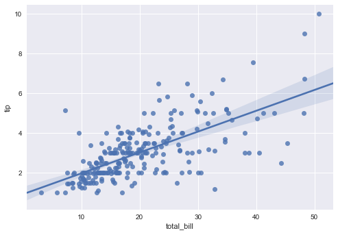
According to the Tip and Total Bill spots distribution, we can find out the linear relationship between those values. Thus we can predict the amount of tip (output) based on the total bill that customers have paid (dependent variable).
How good is our regression?
We have made a regression model, but how good is the model? Here comes the Root-Mean-Square Deviation (RMSD) [or Root-Mean-Square Error (RMSE)]. The RMSD is an indicator of difference between predicted and actual values. It is calculated by:

where

is our predicted value,

is the actual value in observation i , and n is the number of observation.
So a prefect model means a 0 in RMSD and a less effective model means a larger RMSD.
Again, let's try to understand RMSD in a visual learning way.
RMSD in action
We keep using the "tips" data set from the above section, get the first 200 records as learning values and the last 44 records as testing values. learning_x = df_tips[['total_bill', 'size']].values [:200] learning_y = df_tips['tip'].values [:200] testing_x = df_tips[['total_bill', 'size']].values[-44:] testing_y = df_tips['tip'].values[-44:]Then we call out a machine learning model. Since we are doing regression, so we use the Linear Regression model. from sklearn.linear_model import LinearRegression lreg = LinearRegression() lreg.fit(learning_x, learning_y) prediction = lreg.predict(testing_x)Now we have our predicted output, let's compare it with the actual output. import pandas as pd df_output_compare = pd.DataFrame({'predicted':prediction, 'actual':testing_y}) sns.regplot(x="actual", y="predicted", data=df_output_compare) plt.show()
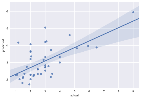
Because we use only 2 features to predict the tip outcome, the predicted values are hard to correlate to actual ones. We can observe this situation from the graph above, but how hard do these 2 values correlate in term of figures? The sklearn library provides a mean_squared_error function which helps us to find the MSE of RMSE(RMSD). Then we can apply a square root on the MSE to get our RMSD.
from sklearn.metrics import mean_squared_error from math import sqrt rmsd = sqrt(mean_squared_error(testing_y, prediction)) print(rmsd)1.189772487870686
Now we use another learning set, the only first 5 records from the "tips" data set.
learning_x_5 = df_tips[['total_bill', 'size']].values [:5] learning_y_5 = df_tips['tip'].values [:5]
And get our new predication:
lreg.fit(learning_x_5), learning_y_5) prediction_5 = lreg.predict(testing_x)
We use our new prediction to compare with the actual output.
df_output_compare_5 = pd.DataFrame({'predicted':prediction_5, 'actual':testing_y}) sns.regplot(x="actual", y="predicted", data=df_output_compare_5, color="g") plt.show()
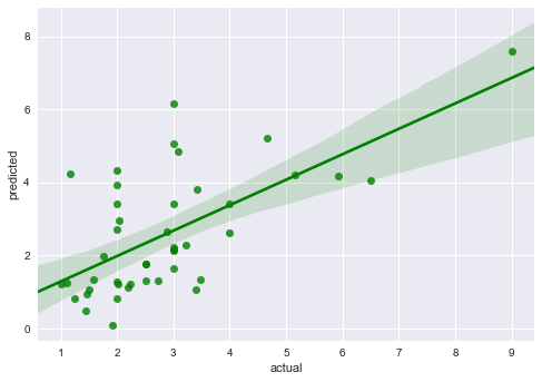
Then calculate the new RMSD: rmsd_5 = sqrt(mean_squared_error(testing_y, prediction_5)) print(rmsd_5)1.3766746955609788As expected, there is a larger RMSD for a less effective model.
Congratulation! Now you can spot the effectiveness of a regression model from graphs and figures.
What have we learnt in this post?
- the use of regression
- how to rate a model from a scatter chart
- the meaning of RMSD / RMSE
- how to rate a model from its RMSD