Titanic Survivors Dataset and Data Wrangling


We have learnt how to select a machine learning model, it is time to study another Data Science topic from the Data Science Life Cycle -- Data Collection.
Yes, we do need to know how to collect data. Unlike our Iris Classification project, which its data set is well prepared. Sometimes, we need to prepare our own data for machine to learn.
Data Wrangling
Then we have another topic to learn -- Data Wrangling. Data Wrangling is a process to transform raw data to machine readable data. This time, we use a well known data set as our subject, the Titanic survivors data sets.
First of all, let's get the data sets from the Titanic Machine Learning competition at Kaggle.com . Although it is called a "competition", it is an entry level data science practice actually.
You can download a train.csv file as a training data set and a test.csv file for result predication. Then we use Pandas to take a look on their data structures:
import pandas as pd
import numpy as np

#replace the file paths for your csv files
train_df = pd.read_csv("Titanic/train.csv")
test_df = pd.read_csv("Titanic/test.csv")

#show the numbers of row and column
print(train_df.shape)
#show the numbers of missing values
print(train_df.apply(lambda x: sum(x.isnull()),axis=0))
print(test_df.shape)
print(test_df.apply(lambda x: sum(x.isnull()),axis=0))
(891, 12)
PassengerId 0
Survived 0
Pclass 0
Name 0
Sex 0
Age 177
SibSp 0
Parch 0
Ticket 0
Fare 0
Cabin 687
Embarked 2
dtype: int64
(418, 11)
PassengerId 0
Pclass 0
Name 0
Sex 0
Age 86
SibSp 0
Parch 0
Ticket 0
Fare 1
Cabin 327
Embarked 0
dtype: int64Our mission for this data science project is to find out the survivors on the testing data set. That is why the "Survived" field is missed from the test.csv file. And we also find that there are missing values in "Age", "Fare", "Cabin" and "Embarked" features, e.g.:
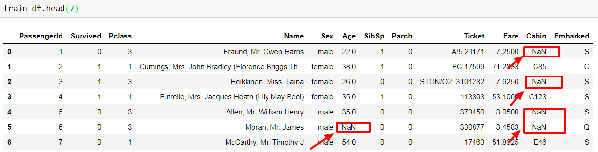
Other than those missing values, "Name", "Sex", "Ticket", "Cabin" and "Embarked" are all non-numeric features. Do not feel frustrated, think positive! This is a chance for us to learn the technique on data wrangling.
Let the machine read the data
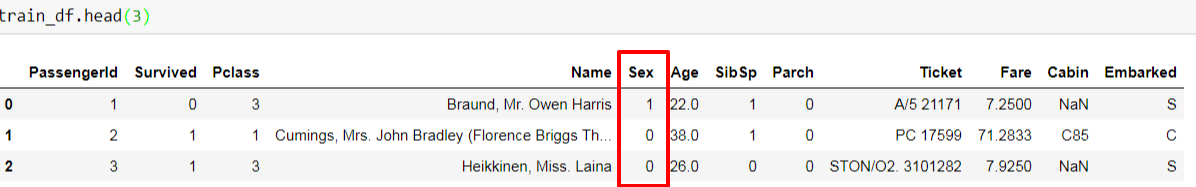
Our objective on data wrangling is to transform raw data to machine read-able data. Let' start from the easiest step first, the "Sex" feature. We open our machine's "eyes" by mapping male as "1" and female as "0":
train_df["Sex"] = train_df["Sex"].map({"male": 1, "female":0})Then we have changed the original "male" and "female" values to machine read-able 1/0 values:
We can apply the same technique on "Embarked" feature, but, we know that there are 2 missing values on the training data set. So we go to check the current content of the "Embarked" feature:
print(train_df['Embarked'].value_counts(ascending=True))
print(train_df['Embarked'].value_counts(normalize=True,ascending=True))
And we got:
Q     77
C    168
S    644
Name: Embarked, dtype: int64
Q    0.086614
C    0.188976
S    0.724409
Name: Embarked, dtype: float64
"S" (Southampton from the data dictation) is the majority of available values, thus we can fill "S" into the 2 missing values and map all values into numbers.
train_df['Embarked'] = train_df['Embarked'].fillna('S')
train_df['Embarked'] = train_df['Embarked'].map( {'S': 0, 'C': 1, 'Q': 2} ).astype(int)
For "Cabin" feature, since there are 687 out of 891 missing records, we can simply skip this feature.
There is no null values in "Ticket" feature, but I hardly find the data-real life relationship between survival rate and ticket number, so we skip this feature as well.
That's Not My Name
Now we only have one non-numeric feature to solve: "Name". We find that other than first name and last name, there is title stored in the "Name" column as well. Let's take a closer look on the title value.
#get title from name
train_df['Title'] = df['Name'].apply(lambda x: x.split(",")[1].split(".")[0].strip())
print(train_df['TicketPrefix'].value_counts(ascending=True, dropna=False))
Ms 1
Mme 1
Capt 1
Sir 1
Jonkheer 1
the Countess 1
Lady 1
Don 1
Major 2
Col 2
Mlle 2
Rev 6
Dr 7
Master 40
Mrs 125
Miss 182
Mr 517We group different titles according to their social status and similarity.
train_df["Title"] = train_df["Title"].replace(['Lady', 'the Countess','Countess','Capt', 'Col','Don', 'Dr', 'Major', 'Rev', 'Sir', 'Jonkheer', 'Dona'], 'Rare')
train_df['Title'] = train_df['Title'].replace('Mlle', 'Miss')
train_df['Title'] = train_df['Title'].replace('Ms', 'Miss')
train_df['Title'] = train_df['Title'].replace('Mme', 'Mrs')
And see their relationship with survival rate.
import matplotlib.pyplot as plt
import seaborn as sns

sns.barplot(x="Title", y="Survived", data=train_df)

plt.show()
Please note that we are using seaborn library, which is built on top of matplotlib. It provides further enhancement on both functionality and presentation for plotting. In short: an upgrade.
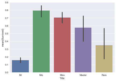
Obviously, female ("Mrs" and "Miss" groups) got much better chance to survive. But "Rare" and "Master" title groups had better survival rates than "Mr" group. Sometimes, having better title does not only mean having better social status, it pays off in the game of surviving.
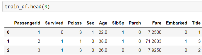
We map title group into numeric values and drop unused features.
title_mapping = {"Mr": 1, "Miss": 2, "Mrs": 3, "Master": 4, "Rare": 5}
train_df['Title'] = train_df['Title'].map(title_mapping)

train_df = train_df.drop(["Name", "Ticket", "Cabin"], axis=1)
Then we have an all-numeric data set:
The Number Game
Now we focus on the numeric features. "SibSp" and "Parch" represent siblings, spouses, parents and children, i.e. family members. We make a new feature, "FamilySize", for storing these 2 features. And check its relationship with survival rate using kernel density estimate graph.
train_df['FamilySize'] = train_df['SibSp'] + train_df['Parch'] + 1

facet = sns.FacetGrid(train_df, hue="Survived",aspect=4)
facet.map(sns.kdeplot,'FamilySize',shade= True)
facet.set(xlim=(0, train_df['FamilySize'].max()))
facet.add_legend()

plt.show()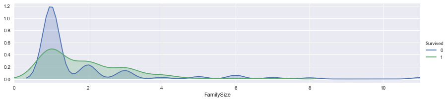
It is quite sure that, passengers with 2 or 3 family members are easier to survive then those individual travelers. Then we separate "FamilySize" into 4 different groups.
bins = (-1, 1, 2, 3, 12)
group_names = [1,2,3,4]
categories = pd.cut(train_df['FamilySize'], bins, labels=group_names)
train_df['FamilyGroup'] = categories
On the family size feature, it raises out another question. Would passengers with parent and children have better chance to survive than people with siblings and spouses? Thus I create following 2 features, "withP" (with parents/children) and "withS" (with siblings/spouses):
train_df['withP']=0
train_df['withS']=0

train_df.loc[train_df['SibSp'] > 0, 'withS'] = 1
train_df.loc[train_df['Parch'] > 0, 'withP'] = 1

sns.barplot(x="withP", y="Survived", hue="withS", data=train_df)
plt.show()
And compare their relationship with survival rates:
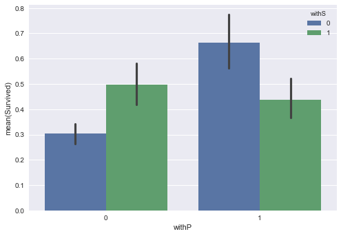
When parents/children are passengers only relatives on the ship, they have better chance to survive than others.
Money, Money, Money
It is time to put passengers' fare into our model learning routine, but:
fare_dist = sns.distplot(train_df["Fare"], color="m", label="Skewness : %.2f"%(train_df["Fare"].skew()))
fare_dist = fare_dist.legend(loc="best")
plt.show()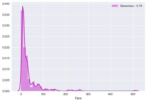
There are extreme values inside the "Fare" feature. On this case, we can use logarithm to remove the impact of extreme values.
train_df["Fare"] = train_df["Fare"].fillna(train_df["Fare"].median())
train_df['Fare_log'] = train_df["Fare"].map(lambda i: np.log(i) if i > 0 else 0)

fare_log_dist = sns.distplot(train_df["Fare_log"], color="m", label="Skewness : %.2f"%(train_df["Fare_log"].skew()))
fare_log_dist = fare_log_dist.legend(loc="best")
plt.show()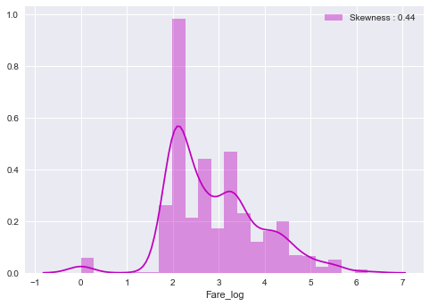
See? The skewness has been changed from 4.79 to 0.44!
facet = sns.FacetGrid(train_df, hue="Survived",aspect=4)
facet.map(sns.kdeplot,'Fare_log',shade= True)
facet.set(xlim=(0, train_df['Fare_log'].max()))
facet.add_legend()

plt.show()

bins = (-1, 2, 2.68, 3.44, 10)
group_names = [1,2,3,4]
categories = pd.cut(train_df['Fare_log'], bins, labels=group_names)
train_df['FareGroup'] = categories
According to the fare_log facet grid graph, we cut the fare_log into 4 groups.

We are almost done, let's finish our last feature, the Age.
For the Age feature in our training data set, there are 177 out of 891 missing values. First, we would like to know the correlation of age and other features by using a heat map.
age_heat = sns.heatmap(train_df[["Age","Sex","SibSp","Parch","Pclass","Embarked"]].corr(),annot=True)
plt.show() 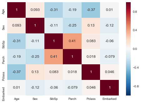
We find that "SibSp", "Parch" and "Pclass" are relevant to "Age". Thus, instead of filling those missing ages with the mean value, we should compare the ages of passengers with similar family sizes and classes. If no similar background is found, we fill the missing age with a random value between the mean value minus standard deviation and the mean value plus standard deviation.
index_NaN_age = list(train_df["Age"][train_df["Age"].isnull()].index)

for i in index_NaN_age :
  age_mean = train_df["Age"].mean()
  age_std = train_df["Age"].std()
  age_pred_w_spc = train_df["Age"][((train_df['SibSp'] == train_df.iloc[i]["SibSp"]) & (train_df['Parch'] == train_df.iloc[i]["Parch"]) & (train_df['Pclass'] == train_df.iloc[i]["Pclass"]))].mean()
  age_pred_wo_spc = np.random.randint(age_mean - age_std, age_mean + age_std)

  if not np.isnan(age_pred_w_spc) :
     train_df['Age'].iloc[i] = age_pred_w_spc
  else :
     train_df['Age'].iloc[i] = age_pred_wo_spc
Now we have handled all non-numeric/missing values, we can drop those unused features.
X_learning = train_df.drop(['Name', 'Cabin', 'SibSp', 'Parch', 'Fare', 'Survived', 'Ticket', 'Fare_log', 'FamilySize', 'PassengerId'], axis=1)
Y_learning = train_df['Survived']
K-Fold Cross-Validation Time
Do you remember the K-Fold Cross Validation process on last post? Yes, it is the process to choose a suitable learning model. We have our well formatted training data set, it is time to use it on the validation.
random_state = 33
models = []
models.append(("RFC", RandomForestClassifier(random_state=random_state)) )
models.append(("ETC", ExtraTreesClassifier(random_state=random_state)) )
models.append(("ADA", AdaBoostClassifier(random_state=random_state)) )
models.append(("GBC", GradientBoostingClassifier(random_state=random_state)) )
models.append(("SVC", SVC(random_state=random_state)) )
models.append(("LoR", LogisticRegression(random_state=random_state)) )
models.append(("LDA", LinearDiscriminantAnalysis()) )
models.append(("QDA", QuadraticDiscriminantAnalysis()) )
models.append(("DTC", DecisionTreeClassifier(random_state=random_state)) )
models.append(("XGB", xgb.XGBClassifier()) )
Please note that, other than popular classifier models from Scikit Learn library, I have added XGBoost Classifier (XGBoost) into the model list. XGBoost is a powerful boosting algorithm and always be chosen as a winning tool in data analysis competition.
from sklearn import model_selection

kfold = model_selection.KFold(n_splits=10)

for name, model in models:
     #cross validation among models, score based on accuracy
     cv_results = model_selection.cross_val_score(model, X_learning, Y_learning, scoring='accuracy', cv=kfold )
     print("\n[%s] Mean: %.8f Std. Dev.: %8f" %(name, cv_results.mean(), cv_results.std()))
And the results are:
[RFC] Mean: 0.80365793 Std. Dev.: 0.033661
[ETC] Mean: 0.78902622 Std. Dev.: 0.030693
[ADA] Mean: 0.80585518 Std. Dev.: 0.032839
[GBC] Mean: 0.82720350 Std. Dev.: 0.033126
[SVC] Mean: 0.79242197 Std. Dev.: 0.047439
[LoR] Mean: 0.80810237 Std. Dev.: 0.029757
[LDA] Mean: 0.79574282 Std. Dev.: 0.034687
[QDA] Mean: 0.79466916 Std. Dev.: 0.042005
[DTC] Mean: 0.77669164 Std. Dev.: 0.026440
[XGB] Mean: 0.83053683 Std. Dev.: 0.031099
In bar chart:
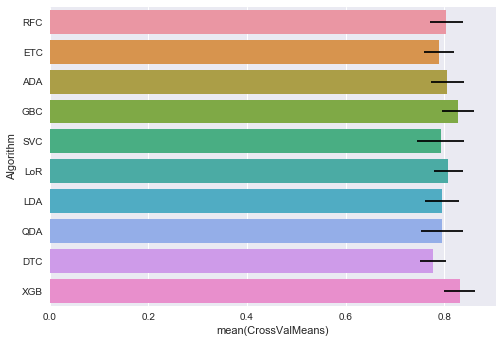
Obviously, XGBoost tops the K-Fold Cross Validation and it is followed by the Gradient Boosting Classifier. (Oh, boosting algorithm rules the game this time)
Since we are focusing on Data Wrangling this time not model tuning, I just use a plain XGBoost to predict the testing data set and submit to Kaggle. It gives me 0.78469 score.
There is still room for improvement, I hope all of you can learn from this post and make a better model. Just remember, practice makes perfect, enjoy.
The complete source can be found at https://github.com/codeastar/kaggle_Titanic .