To win big in real estate market using data science - Part 1

Okay, yes, once again, it is a catchy topic. BUT, this post is indeed trying to help people (including me) to gain an upper hand in real estate market, using data science.
From our last post (2 months ago, I will try to update this blog more frequently :]] ), we learn that we can use regression to predict a restaurant tips trend in data science. And now we can apply this finding to a Kaggle competition, House Prices: Advanced Regression Techniques , in order to predict a house price trend.
To Win in Real Estate Market
Don't you feel excited by seeing the heading above? Yes! In trading, pricing is the most critical component to maximizing your profit. You can make better decision when you know what the right price is.
From the Kaggle Housing competition, our goal is to predict the right prices of 1450+ properties according to 75+ features.
First things first, since there are 75+ features on the data sets, it is good to download the data description file from Kaggle to find out their meanings.
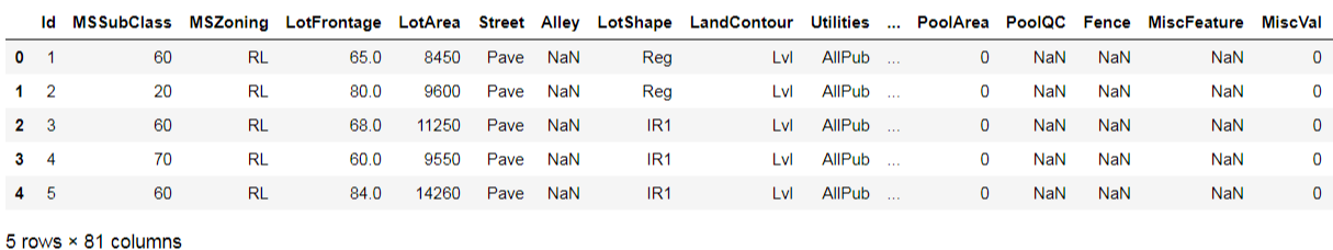
Then we get training and testing data sets, load them into data frames and query their data size.
import pandas as pd df_train = pd.read_csv("train.csv") df_test = pd.read_csv("test.csv") print("Size of training dataset:", df_train.shape) print("Size of testing dataset:", df_test.shape) Size of training dataset: (1460, 81) Size of testing dataset: (1459, 80)
Last time, we predicted about 400 passengers' statuses. This time, we raise the bar! We are going to predict 1459 records using just 1460 records.
Let's get a feeling of what the training data set looks like:
df_train.head(5)
Next, we go to check if there are null values inside the data set.
import matplotlib.pyplot as plt import seaborn as sns df_missing = df_train.isnull().sum() df_missing = df_missing[df_missing > 0] sns.barplot(x=df_missing.values, y=df_missing.index) plt.show()
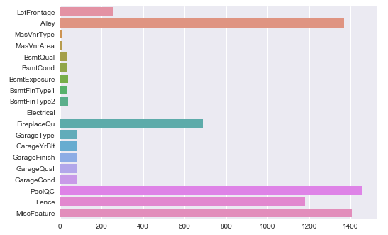
Oh, there are many actually.
Enter the void
Don't worry, according to the data description, null values mean "None" or 0 in related features. E.g. it is "No alley access" for null values in "Alley", and it is 0 masonry veneer area square feet in "MasVnrArea". That is why I suggest we need to take a look on the data description file first.
Here comes the solution. We can add a function to handle null values in the data set, by filling 0, "None" or the most common values in the features.
def fillNAonDF(df): for feat in ('MSZoning', 'Utilities','Exterior1st', 'Exterior2nd', 'BsmtFinSF1', 'BsmtFinSF2', 'Electrical'): df.loc[:, feat] = df.loc[:, feat].fillna(df[feat].mode()[0]) for feat in ('BsmtUnfSF','TotalBsmtSF', 'BsmtFullBath', 'BsmtHalfBath', 'KitchenQual', 'Functional', 'SaleType'): df.loc[:, feat] = df.loc[:, feat].fillna(df[feat].mode()[0]) for feat in ('Alley','BsmtQual', 'BsmtCond', 'BsmtExposure', 'BsmtFinType1', 'BsmtFinType2'): df.loc[:, feat] = df.loc[:, feat].fillna("None") for feat in ('MasVnrType', 'FireplaceQu','GarageType', 'GarageFinish', 'GarageQual', 'GarageCond'): df.loc[:, feat] = df.loc[:, feat].fillna("None") for feat in ('MasVnrArea', 'GarageYrBlt', 'GarageArea', 'GarageCars'): df.loc[:, feat] = df.loc[:, feat].fillna(0) for feat in ('PoolQC','Fence', 'MiscFeature'): df.loc[:, feat] = df.loc[:, feat].fillna("None") df.loc[:, 'LotFrontage'] = df.groupby('Neighborhood')['LotFrontage'].transform(lambda x: x.fillna(x.median()))
And apply it on both training and testing data sets.
fillNAonDF(df_train) fillNAonDF(df_test)
Poof! Now the void issue was gone.
Size does matter
There are 2 major factors affecting a property price, location and size. For size, we can get its information from the "GrLivArea" (above ground living area) feature. And plot a chart to show the relationship between size and sale price: sns.regplot(x="GrLivArea", y="SalePrice", data=df_train) plt.show()
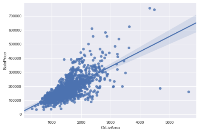
Well, it looks linear, however there are 2 outliers on the bottom right. Those 2 properties are sized 4000+ square feet but sold with unreasonable low prices. According to the author of the data set, Dr. Dean De Cock, he would recommend removing any houses with more than 4000 square feet. In order to eliminate unusual observations.
So we remove data with living area larger than 4000 square feet and plot the regression chart again.
df_train = df_train.loc[df_train.GrLivArea < 4000] sns.regplot(x="GrLivArea", y="SalePrice", data=df_train) plt.show()
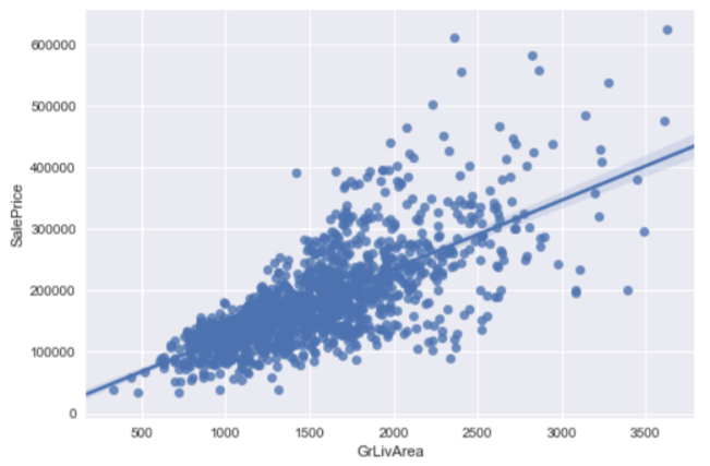
It then looks more linear now.
Money, Money, Money, again
Sale price is the target we are going to predict. First, let' see how it distributes in the training data set: price_dist = sns.distplot(df_train["SalePrice"], color="m", label="Skewness : %.2f"%(df_train["SalePrice"].skew())) price_dist = price_dist.legend(loc="best") plt.show()
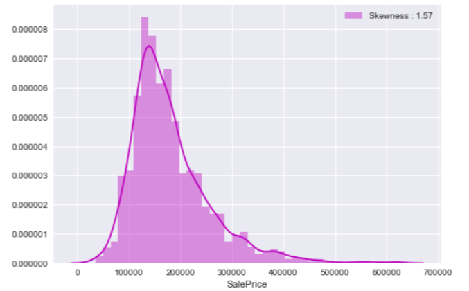
We saw a similar chart in our past data science exercise, the Titanic Project, when we analyzed passengers' fare variable. The distribution doesn't look like a normal distribution as there are a few high sale price records. From our last experience in fare feature, we can apply the same logarithm handling to remove the impact of extreme values.
df_train.loc[:,'SalePrice_log'] = df_train["SalePrice"].map(lambda i: np.log1p(i) if i > 0 else 0) price_log_dist = sns.distplot(df_train["SalePrice_log"], color="m", label="Skewness : %.2f"%(df_train["SalePrice_log"].skew())) price_log_dist = price_log_dist.legend(loc="best") plt.show()
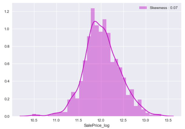
After that, the skewness of sale price is improved and we have a better distribution of sale price.
Features Engineering
Since we are doing machine learning, we must transform features for machine to read and learn. In short, change all to numerical features. Before we do that, we are going to change "MoSold" and "MSSubClass" features that use numerical values back to categorical features (that is why I say we have to read the data description file first). def trxNumericToCategory(df): df['MSSubClass'] = df['MSSubClass'].apply(str) df['MoSold'] = df['MoSold'].apply(str)
trxNumericToCategory(df_train)
trxNumericToCategory(df_test)
Our next step, we get categorical features and change them to numerical features by the means of sale price.def quantifier(df, feature, df2): new_order = pd.DataFrame() new_order['value'] = df[feature].unique() new_order.index = new_order.value new_order['price_mean'] = df[[feature, 'SalePrice_log']].groupby(feature).mean()['SalePrice_log'] new_order= new_order.sort_values('price_mean') new_order = new_order['price_mean'].to_dict() for categorical_value, price_mean in new_order.items(): df.loc[df[feature] == categorical_value, feature+'_Q'] = price_mean df2.loc[df2[feature] == categorical_value, feature+'_Q'] = price_mean categorical_features = df_train.select_dtypes(include = ["object"]) for f in categorical_features: quantifier(df_train, f, df_test)
After the transformation, we can drop those categorical features. And now we have machine read-able both training and testing data sets.
Skew Them All
We have skewed the sale price feature to obtain a better distribution, we can do the same thing on all other features as well.
First of all, we combine the training and testing data sets into an "all data" data set.
df_all_data = pd.concat((df_train, df_test)).reset_index(drop=True) train_index = df_train.shape[0]
Then we find and skew features that have greater than 0.75 skewness.
def skewFeatures(df): skewness = df.skew().sort_values(ascending=False) df_skewness = pd.DataFrame({'Skew' :skewness}) df_skewness= df_skewness[abs(df_skewness) > 0.75] df_skewness = df_skewness.dropna(axis=0, how='any') skewed_features = df_skewness.index for feat in skewed_features: df[feat] = np.log1p(df[feat]) skewFeatures(df_all_data)
Done! And it is the time to get our finalized training and testing data sets.
X_learning = df_all_data[:train_index] X_test = df_all_data[train_index:] Y_learning = df_train['SalePrice_log']
X data, check. Y data, check. Test data, check. What time is it? It's clobber... err.. It's modeling time!
Modeling Time
Do you remember the way we choose a model for machine learning? Yes, we use the k-fold cross validation to pick our model.
We have chosen several common regression models, plus the people's favorite XGBoost model, for this house price project:
models = [] models.append(("LrE", LinearRegression() )) models.append(("RidCV", RidgeCV() )) models.append(("LarCV", LarsCV() )) models.append(("LasCV", LassoCV() )) models.append(("ElNCV", ElasticNetCV() )) models.append(("LaLaCV", LassoLarsCV() )) models.append(("XGB", xgb.XGBRegressor() ))
Then we apply the 10-fold cross validation on our models.
kfold = KFold(n_splits=10) def getCVResult(models, X_learning, Y_learning): for name, model in models: cv_results = cross_val_score(model, X_learning, Y_learning, scoring='neg_mean_squared_error', cv=kfold ) rmsd_scores = np.sqrt(-cv_results) print("\n[%s] Mean: %.8f Std. Dev.: %8f" %(name, rmsd_scores.mean(), rmsd_scores.std())) getCVResult(models, X_learning, Y_learning)
And get their mean values of RMSD:
[LrE] Mean: 0.11596371 Std. Dev.: 0.012097 [RidCV] Mean: 0.11388354 Std. Dev.: 0.012075 [LarCV] Mean: 0.11630241 Std. Dev.: 0.011665 [LasCV] Mean: 0.19612691 Std. Dev.: 0.008914 [ElNCV] Mean: 0.19630787 Std. Dev.: 0.008867 [LaLaCV] Mean: 0.11258596 Std. Dev.: 0.012750 [XGB] Mean: 0.11961144 Std. Dev.: 0.016610
In bar chart:
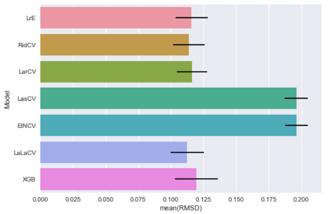
The major purpose of this CV is to get a rough idea on what the RMSD value looks like. Since we do not pass any parameter into those models, I believe there is room for improvement to get better scores. Let's move on to our next topic, parameters tuning (on next post :]] ), stay tuned.
What have we learnt in this post?
- Don't miss the data description file
- Skew features to get better distribution
- Handle categorical features
- Use K-fold Cross Validation to get a rough idea of the final result
- I haven't posted more than 2 months, doesn't mean I forget this blog :]]