Blending, the Dark Side in Data Science Competition


In our past machine learning topic, "Ensemble Modeling", we mentioned how blending helps on improving our prediction. Then in another topic, "Why are people frustrated on Kaggle’s challenge?", we mentioned how blending ruins a data science competition. Okay, we have a question here, is blending good or bad?
Blending and Frustration
Technically, blending is good and we did prove it by improving our Iowa House Price's prediction. The technique itself is not an issue. But the way to use it is. From the last TalkingData Click Fraud Detection challenge, people spent days and nights on features engineering and models researching. They posted and shared their results as public kernels. Then some people, we call them "blenders", gathered other people's hard working results, applied the blending technique in 5 minutes and got a better result. It made them have a higher ranking in leaderboard too. If you were one of those hard working developers and got out-ranked by blenders, you might be frustrated.
Get a better result by taking advantage of others
We should not abuse other people's hard work, but we should know how people do that by blending. So we start our experiment in the House Price prediction challenge. First of all, we go to collect output files from 7 best RMSD public kernels. So we have:
- stacking, MICE and brutal force - 0.10985
- Lasso model for regression problem - 0.11365
- House Price Prediction From Bangladesh - 0.11416
- All You Need is PCA - 0.11421
- Amit Choudhary's Kernel Notebook-ified - 0.11439
- just NN use gluon - 0.1148
- My submission to predict sale price - 0.11533 Please note that other than selecting kernels by scores, we trend to select kernels using different model(s).
Then we can download output files from above kernels, open our own kernel (or Jupyter Notebook) and import the output files as our input (feel like the way we did on the CNN image recognizer project: outputs from previous layer are inputs of next layer). import pandas as pd
df_base_0 = pd.read_csv('../input/stacking-mice-and-brutal-force-10985/House_Prices_submit.csv',names=["Id","SalePrice_0"], skiprows=[0],header=None)
df_base_1 = pd.read_csv('../input/lasso-11365/lasso_sol22_Median.csv',names=["Id","SalePrice_1"], skiprows=[0],header=None)
df_base_2 = pd.read_csv('../input/bangladesh-stack-11416/submission (1).csv',names=["Id","SalePrice_2"], skiprows=[0],header=None)
df_base_3 = pd.read_csv('../input/pca-11421/submission (2).csv',names=["Id","SalePrice_3"], skiprows=[0],header=None)
df_base_4 = pd.read_csv('../input/xgb-lasso-11439/output.csv',names=["Id","SalePrice_4"], skiprows=[0],header=None)
df_base_5 = pd.read_csv('../input/nn-1148/submission (3).csv',names=["Id","SalePrice_5"], skiprows=[0],header=None)
df_base_6 = pd.read_csv('../input/stack-xgb-lgb-11533/submission_stacked.csv',names=["Id","SalePrice_6"], skiprows=[0],header=None)
We have 7 dataframes and all of them contain "Id" and "SalePrice" fields. Then we pick 2 dataframes, "df_base_0" and "df_base_5" as examples:
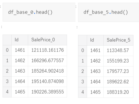
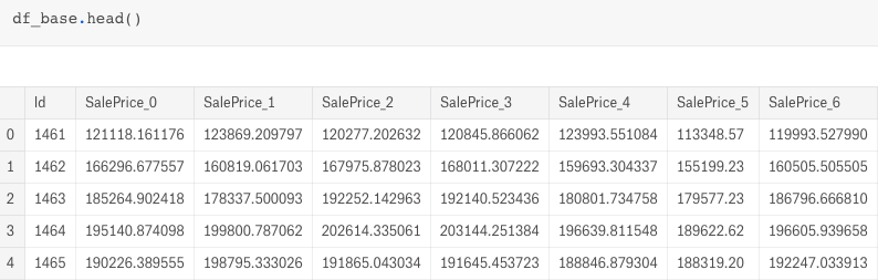
All of our dataframes have the same Id but different SalePrice. So we can merge them into a single dataframe, "df_base", using the Id as the key.
df_base = pd.merge(df_base_0,df_base_1,how='inner',on='Id') df_base = pd.merge(df_base,df_base_2,how='inner',on='Id') df_base = pd.merge(df_base,df_base_3,how='inner',on='Id') df_base = pd.merge(df_base,df_base_4,how='inner',on='Id') df_base = pd.merge(df_base,df_base_5,how='inner',on='Id') df_base = pd.merge(df_base,df_base_6,how='inner',on='Id')
Here it comes:
Instead of blending all the SalePrices and getting the mean score, we can move one step forward to get a better result.
Blend by Correlation
In order to get the better result, we should blend with different sources. That is why we intended to use output files from different models. We can also visualize how those output files are different from one another using interactive heatmap. import plotly.graph_objs as go import plotly.offline as py py.init_notebook_mode(connected=True)
data = [
go.Heatmap(
z = df_base.iloc[:,1:].corr().values,
x = df_base.iloc[:,1:].columns.values,
y = df_base.iloc[:,1:].columns.values,
colorscale='Earth')
]
layout = go.Layout(
title ='Correlation of SalePrice',
xaxis = dict(ticks='outside', nticks=36),
yaxis = dict(ticks='outside' ),
width = 800, height = 700)
fig = go.Figure(data=data, layout=layout)
py.iplot(fig)
Since we are looking for diversity, we pick those SalePrices with low correlation scores. So we have:
- SalePrice_2 (the base)
- SalePrice_0 (score: 0.92)
- SalePrice_4 (score: 0.95)
- SalePrice_5 (score: 0.93)
i.e. the bottom 3rd row from the heatmap
And the magin begins:
new_sp = df_base.SalePrice_0 *.25 + df_base.SalePrice_2 *.25 +df_base.SalePrice_4 *.25 +df_base.SalePrice_5 *.25 sub_sp= pd.DataFrame() sub_sp['id'] = df_base['Id'] sub_sp['SalePrice'] = new_sp sub_sp.to_csv('sub_sp.csv', index=False, float_format='%.9f')
It turns out making a better score as 0.10970 and pushing me to the Top 1% ranking position.
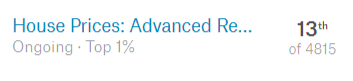
We got the Top 1% position in just few minutes and lines of code, isn't it nice?
Nope.
We are just using other people's hard work and learn nothing from it. Last time we worked with 3 posts for solving the Iowa's House Price challenge, which included feature engineering, parameter tuning and model ensemble topics. Those topics are valuable lessons for making us a better data scientist. Blending is a useful technique, in order to use it for good, I would suggest we use it, once we have made an output from our owns. Then, we apply blending with others. So we can keep learning and get better results.
What have we learnt in this post?
- Usage of blending with correlation
- Good side of blending
- Bad side of blending
- Proper way to blend